
NCERT Solutions | Class 8 Maths Chapter 15 | Introduction to Graphs

CBSE Solutions | Maths Class 8
Check the below NCERT Solutions for Class 8 Maths Chapter 15 Introduction to Graphs Pdf free download. NCERT Solutions Class 8 Maths were prepared based on the latest exam pattern. We have Provided Introduction to Graphs Class 8 Maths NCERT Solutions to help students understand the concept very well.
NCERT | Class 8 Maths
| Book: | National Council of Educational Research and Training (NCERT) |
|---|---|
| Board: | Central Board of Secondary Education (CBSE) |
| Class: | 8th |
| Subject: | Maths |
| Chapter: | 15 |
| Chapters Name: | Introduction to Graphs |
| Medium: | English |
Introduction to Graphs | Class 8 Maths | NCERT Books Solutions
NCERT Solutions for Class 8 Maths Chapter 15 Introduction to Graphs Exercise 15.1
Ex 15.1 Class 8 Maths Question 1.
The following graph shows the temperature of a patient in a hospital, recorded every hour.
(a) What was the patient’s temperature at 1 p.m.?
(b) When was the patient’s temperature 38.5°C?
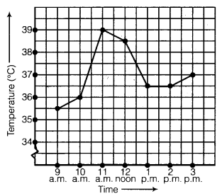
(c) The patient’s temperature was the same two times during the period given. What were these two times?
(d) What was the temperature at 1.30 p.m.? How did you arrive at your answer?
(e) During which periods did the patient’s temperature showed an upward trend.
Solution:
In the graph, we find that the time (in hours) are represented on the x-axis and the temperature (in °C) are represented on the y-axis. The temperature at any time can be read from the graph exactly in the same way as we read the coordinates of a point. From the graph, we observe that :(a) The temperature of the patient at 1 p.m. was 36.5°C.
(b) The temperature of the patient was 38.5°C at 12 noon.
(c) The temperature of the patient was same at 1 p.m. and 2 p.m.
(d) The temperature of the patient at 1.30 p.m. was 36.5°C. The point between 1 p.m. and 2 p.m. on the x-axis is equidistant from the two points showing 1 p.m. and 2 p.m., so it will represent 1.30 p.m. Similarly, the point on the y-axis, between 36°C and 37°C will represent 36.5°C.
(e) During the periods 9 a.m. to 10 a.m., 10 a.m. to 11 a.m. and 2 p.m. to.3 p.m. the patient’s temperature showed an upward trend.
Ex 15.1 Class 8 Maths Question 2.
The following line graph shows the yearly sales figures for a manufacturing company.(a) What were the sales in
(i) 2002
(ii) 2006?
(b) What were the sales in
(i) 2003
(ii) 2005?
(c) Compute the difference between the sales in 2002 and 2006.
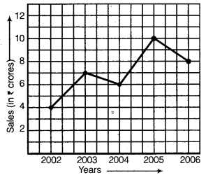
(d) In which year was there the greatest difference between the sales as compared to its previous year?
Solution:
In the graph, we find that the years are represented on the x-axis and the sales (in ? crores) on the y-axis. The sales at any time (year) can be read from the graph exactly in the same way as we read the coordinates of a point. From the graph, we observe that :(a)
(i) The sales in the year 2002 is ₹ 4 crore.
(ii) The sales in the year 2006 is ₹ 8 crore.
(b)
(i) The sales in the year 2003 is ₹ 7 crore.
(ii) The sales in the year 2005 is ₹ 10 crore.
(c) The difference between the sales in 2002 and 2006 = ₹ 8 crore – ₹4 crore = ₹ 4 crore.
(d) The year in which there was the greatest difference between the sales as compared to its previous year is the year 2005.
Ex 15.1 Class 8 Maths Question 3.
For an experiment in Botany, two different plants, plant A and plant B were grown under similar laboratory conditions. Their heights were measured at the end of each week for 3 weeks. The results are shown by the following graph :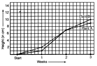
(a) How high was Plant A after (i) 2 weeks (ii) 3 weeks?
(b) How high was Plant B after (i) 2 weeks (ii) 3 weeks?
(c) How much did Plant A grow during the 3rd week?
(d) How much did Plant B grow from the end of the 2nd week to the end of the 3rd week?
(e) During which week did Plant A grow most?
(f) During which week did Plant B grow least? *
(g) Were the two plants of the same height during any week shown here? Specify.
Solution:
In the graph, we find that the weeks are represented on the x-axis and the heights (in cm) of two plants A and B on the y-axis. The heights on any week of plants A and B can be read from the graph exactly in the same way as we read the coordinates of a point. From the graph, we observe that :(a) The height of the plant A after
(i) 2 weeks was 7 cm
(ii) 3 weeks was 9 cm.
(b) The height of the plant B after
(i) 2 weeks was 7 cm
(ii) 3 weeks was 10 cm.
(c) The plant A grows 2 cm during the 3rd week.
(d) The plant B grows 3 cm from the end of the 2nd week to the end of the 3rd week.
(e) The plant A grows most during second week.
(f) The plant B grows most during first week.
(g) At the end of the 2nd week the heights of the two plants were the same.
Ex 15.1 Class 8 Maths Question 4.
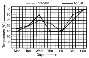
The following graph shows the temperature forecast and the actual temperature for each day of a week.(a) On which days was the forecast temperature the same as the actual temperature?
(b) What was the maximum forecast temperature during the week?
(c) What was the minimum actual temperature during the week?
(d) On which day did the actual temperature differ the most from the forecast temperature?
Solution:
In the graph, we find that the days are represented on the x-axis and the temperature forecast/actual (°C) on the y-axis. The temperature on any day can be read from the graph exactly in the same way as we read the coordinates of a point. From the graph, we observe that :(a) The days on which the forecast temperature was the same as the actual temperature are Tuesday, Friday and Sunday.
(b) The maximum forecast temperature during the week was 35°C.
(c) The minimum actual temperature during the week was 15°C,
(d) The actual temperature differed the most from the forecast temperature on Thursday.
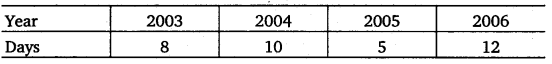
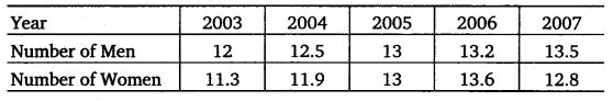
Ex 15.1 Class 8 Maths Question 5.
Use the tables below to draw linear graphs.(a) The number of days a bill side city received snow in different years.
(b) Population (in thousands) of men and women in a village in different years.
Solution:
(a) In order to draw the required graph, we represent years on the x-axis and the days on the y-axis. We first plot the ordered pairs (2003, 8), (2004,10), (2005, 5) and (2006, 12) as points and then join them byline segments as shown below :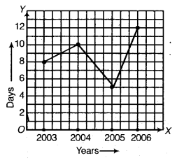
(b) In order to draw the required graph, we represent years on the x-axis and the population (in thousands) on the y-axis. The dotted line shows the population (in thousands) of men and the solid line shows the population (in thousands) of women.
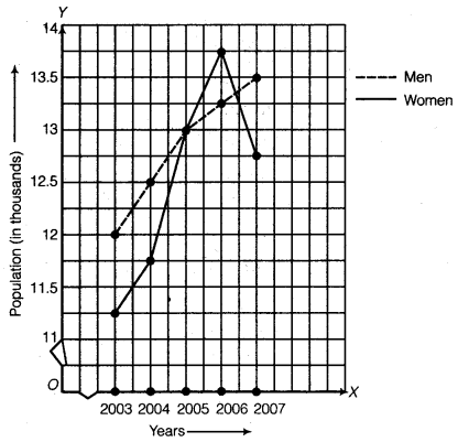
We first plot the ordered pairs (2003; 12), (2004, 12.5), (2005, 13), (2006, 13.2) and (2007, 13.5) and then join them by the dotted line as shown to get the graph representing the number of men. Further, we plot (2003, 11.3), (2004, 11.9), (2005, 13), (2006, 13.6) and (2007, 12.8) and then join them by line segments as shown to get the graph representing the graph of number of women.
Thus, the required graph is obtained.
Ex 15.1 Class 8 Maths Question 6.
A courier-person cycles from a town to a neighbouring suburban area to deliver a parcel to a merchant. His distance from the town at different times is shown by the following graph :(a) What is the scale taken for the time axis?
(b) How much time did the person take for the travel?
(c) How far is the place of the merchant from the town?
(d) Did the person stop on his way? Explain.
(e) During which period did he ride fastest?
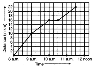
Solution:
In the graph, we find that the time (in hours) is represented on the x-axis and the distance (in km) is represented on the y-axis. The distance at any time can be read from the graph exactly in the same way as we read the coordinates of a point. From the graph, we observe that :(a) The scale taken for the time axis is : 4 units = 1 hour.
(b) The person took 3\(\frac { 1 }{ 2 } \) hours for the travel.
(c) The merchant’s place from the town is 22 km.
(d) Yes; this is indicated by the horizontal part of the graph (10 a.m. -10.30 a.m.)
(e) Between 8 a.m. and 9 a.m. he ride faster.
Ex 15.1 Class 8 Maths Question 7.
Can there be a time-temperature graph as follows? Justify your answer.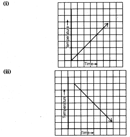
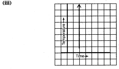
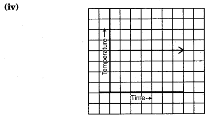
Solution:
(i) This represents a time-temperature graph because it represents a smooth rise in temperature and is represented by a line graph.(ii) This represents a time-temperature graph because it represent a smooth fall in temperature and is represented by a line graph.
(iii) This does not represent a time-temperature because it shows different temperatures at the same time.
(iv) This represents a time-temperature graph because it shows a constant temperature at different times and is a line graph.
NCERT Solutions for Class 8 Maths Chapter 15 Introduction to Graphs Exercise 15.2
Ex 15.2 Class 8 Maths Question 1.
Plot the following points on a graph sheet. Verify if they lie on a line
(a) A(4, 0), B(4, 2), C(4, 6), D(4, 2.5)
(b) P(1, 1), Q(2, 2), R(3, 3), S(4, 4)
(c) K(2, 3), L(5, 3), M(5, 5), N(2, 5).
Solution:
(a) Draw the x-axis and y-axis. Plot the points A(4, 0), B(4, 2), C(4, 6) and D(4, 2.5) as shown. Clearly, these points lie on a line ABDC.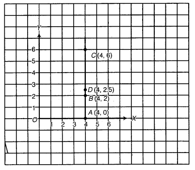
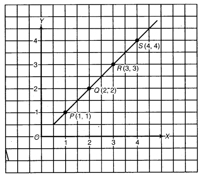
Clearly, these points lie on a line PQRS.
(c) Draw the x-axis and y-axis. Plot the points K(2, 3), L(5, 3), M(5, 5) and N(2, 5) as shown.
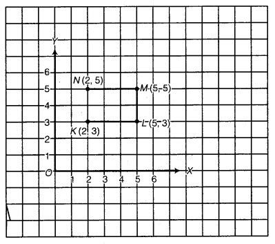
Clearly, these points do not lie on a line.
Ex 15.2 Class 8 Maths Question 2.
Draw the line passing through (2, 3) and (3, 2). Find the coordinates of the points at which this line meets the x-axis and y-axis.Solution:
Draw the x-axis and y-axis. Plot the points P(2, 3) and Q(3, 2). Join PQ and produce PQ on both sides to meet the x-axis at A and y-axis atB. Clearly, the coordinates of A and B are (5, 0) and (0, 5) respectively.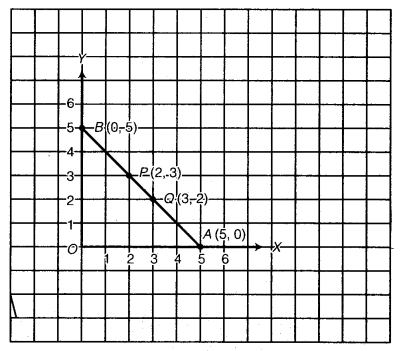
Ex 15.2 Class 8 Maths Question 3.
Write the coordinates of the vertices of each of these adjoining figures.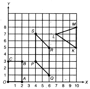
Solution:
Clearly, from the graph the coordinates of points are :O(0, 0), A(2, 0), B(2, 3) and C(0, 3);
P(4, 3), Q(6, 1), R(6, 5) and S(4, 7);
L(7, 7), M(10, 8) and k(10, 5).
Ex 15.2 Class 8 Maths Question 4.
State whether True or False. Correct that are false.(i) A point whose x-coordinate is zero and y-coordinate is non-zero will lie on the y-axis.
(ii) A point whose y-coordinate is zero and x-coordinate is 5 will lie on y-axis.
(iii) The coordinates of the origin are (0, 0).
Solution:
(i) True.(ii) False. Correct statement is : A point whose y-coordinate is zero and x-coordinate is 5 will he on x-axis.
(iii) True.
NCERT Solutions for Class 8 Maths Chapter 15 Introduction to Graphs Exercise 15.3
Ex 15.3 Class 8 Maths Question 1.
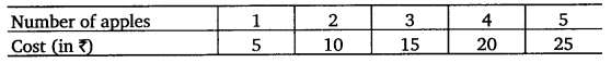
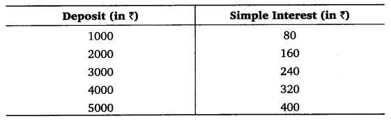
Draw the graphs for the following tables of values, with suitable scales on the axes.
(a) Cost of apples
(b) Distance travelled by a car
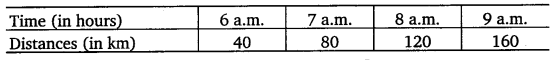
(i) How much distance did the car cover during the period 7.30 a.m. to 8 a.m.?
(ii) What was the time when the car had covered a distance of 100 km since it’s start? Interest on deposits for a year
(c) Interest on deposits for a year.
(i) Does the graph pass through the origin?
(ii) Use the graph to find the interest on ( 2500 for a year.
(iii) To get an interest of? 280 per year, how much money should be deposited?
Solution:
(a) In order to represent the given data graphically, we represent ‘Number of apples, on the x-axis and ‘Cost of apples (in ₹)’ on the y-axis. The ordered pairs (1, 5), (2, 10), (3, 15), (4, 20) and (5, 25) are plotted as points and are joined by the line segments as shown in the figure. This gives the required graph.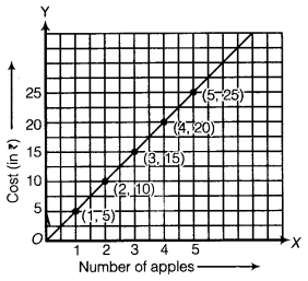
(b) In order to draw time-distance graph, we represent the time (in hours) on x-axis and the distances (in km) on y-axis.
Scale : 2 units = 1 hour on x-axis and 1 unit = 10 km on y-axis.
Plot the points (6, 40), (7, 80), (8, 120) and (9, 160).
Join them by the line segments to obtain the required graph given below :
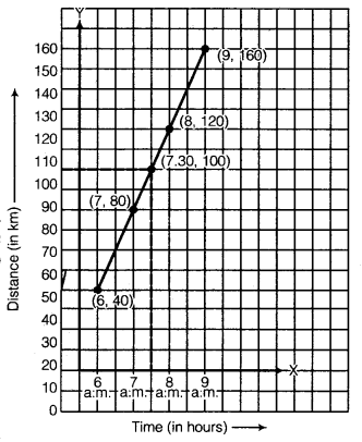
(i) Clearly, from the graph E” distance covered by the s car during 7.30 a.m. to g 8.00 a.m. is 20 km. §
(∵ 120 -100 =20 km)
(ii) The time when the car had covered 100 km since it’s start is 7.30 a.m.
(c) In order to draw principal-simple interest graph, we represent deposits (in X) on x-axis and the simple interest (in ₹) on y-axis.
Scale : 1 unit = ₹ 1000 on x-axis.
1 unit = ₹ 80 on y-axis.
Plot the points (1000, 80), (2000, 160), (3000, 240), (4000, 320) and (5000, 400).
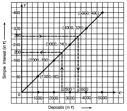
Join these points to obtain the required graph.
Yes, the graph passes through origin.
(ii) Corresponding to ₹ 2500 on the x-axis, we get the interest to be ₹ 200 on the y-axis.
(iii) Corresponding to ₹ 280 per year on the y-axis, we get the sum to be ₹ 3500 on the x-axis.
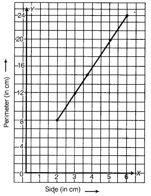
Ex 15.3 Class 8 Maths Question 2.
Draw a graph for the following :(i)
Is it a linear graph?
(ii)
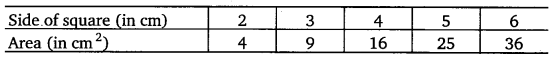
Is it a linear graph?
Solution:
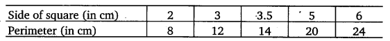
(i) In order to represent the given data graphically, we represent the side of square (in cm) on the x-axis and the perimeter (in cm) on the y-axis. Scale : 1 units = 1 cm on x-axis and y-axis.Plot the points (2, 8), (3, 12), (3.5, 14), (5, 20) and (6, 24). Join these points to obtain the required graph.
It is a linear graph.
(ii) In order to represent the given data graphically, we represent the side of square (in cm) on the x-axis and the area (in cm2) on the y-axis. Scale : 1 unit = 1 cm on x-axis and 1 unit = 1 cm2 on y-axis.
Plot the points (2, 4), (3, 9), (4, 16), (5, 25) and (6, 36). Join these points to obtain the required graph.
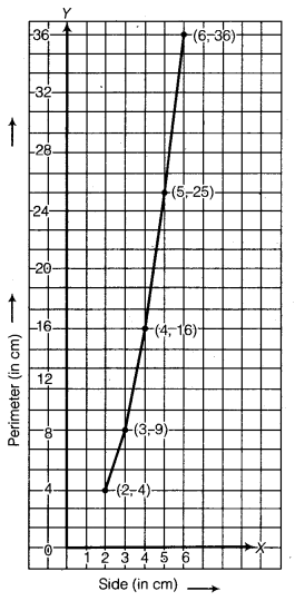
It is not linear.
NCERT Class 8 Maths
Class 8 Maths Chapters | Maths Class 8 Chapter 15
NCERT Solutions for Class 8 Maths
NCERT Solutions of Maths Class 8 Chapter-wise
Chapter-wise NCERT Solutions for Class 8 Maths
-
NCERT Solutions For Class 8 Maths Chapter 1 Rational Numbers
NCERT Solutions For Class 8 Maths Chapter 2 Linear Equations in One Variable
NCERT Solutions For Class 8 Maths Chapter 3 Understanding Quadrilaterals
NCERT Solutions For Class 8 Maths Chapter 4 Practical Geometry
NCERT Solutions For Class 8 Maths Chapter 5 Data Handling
NCERT Solutions For Class 8 Maths Chapter 6 Squares and Square Roots
NCERT Solutions For Class 8 Maths Chapter 7 Cubes and Cube Roots
NCERT Solutions For Class 8 Maths Chapter 8 Comparing Quantities
NCERT Solutions For Class 8 Maths Chapter 9 Algebraic Expressions and Identities
NCERT Solutions For Class 8 Maths Chapter 10 Visualising Solid Shapes
NCERT Solutions For Class 8 Maths Chapter 11 Mensuration
NCERT Solutions For Class 8 Maths Chapter 12 Exponents and Powers
NCERT Solutions For Class 8 Maths Chapter 13 Direct and Indirect proportions
NCERT Solutions For Class 8 Maths Chapter 14 Factorisation
NCERT Solutions For Class 8 Maths Chapter 15 Introduction to Graphs
NCERT Solutions For Class 8 Maths Chapter 16 Playing with Numbers
NCERT Solutions for Class 6 to 12
-
NCERT Solutions for Class 6 All Subjects
NCERT Solutions for Class 7 All Subjects
NCERT Solutions for Class 8 All Subjects
NCERT Solutions for Class 9 All Subjects
NCERT Solutions for Class 10 All Subjects
NCERT Solutions for Class 11 All Subjects
NCERT Solutions for Class 12 All Subjects
Post a Comment
इस पेज / वेबसाइट की त्रुटियों / गलतियों को यहाँ दर्ज कीजिये
(Errors/mistakes on this page/website enter here)