
NCERT Solutions | Class 11 Economics Statistics for Economics Chapter 4 | Presentation of Data

CBSE Solutions | Economics Class 11
Check the below NCERT Solutions for Class 11 Economics Statistics for Economics Chapter 4 Presentation of Data Pdf free download. NCERT Solutions Class 11 Economics were prepared based on the latest exam pattern. We have Provided Presentation of Data Class 11 Economics NCERT Solutions to help students understand the concept very well.
NCERT | Class 11 Economics Statistics for Economics
| Book: | National Council of Educational Research and Training (NCERT) |
|---|---|
| Board: | Central Board of Secondary Education (CBSE) |
| Class: | 11 |
| Subject: | Economics |
| Chapter: | 4 |
| Chapters Name: | Presentation of Data |
| Medium: | English |
Presentation of Data | Class 11 Economics | NCERT Books Solutions
Statistics for Economics Class 11 NCERT Solutions Chapter 4 Presentation of Data
Answer: the following questions, 1 to 10, choosing the correct answer.
Question 1.
Bar diagram is a
(a) one-dimensional diagram
(b) two-dimensional diagram
(c) diagram with no dimension
(d) None of these
Answer:
(a) Bar diagrams are one-dimensional diagrams. Though these are represented on a plane of two axis in form of rectangular bars, the width is of no consequence and only the length depicts the frequency.Question 2.
(a) mean
(b) mode
(c) median
(d) All of these
Answer:
(b) Histogram gives value of mode of the frequency distribution graphically through the highest rectangle.Question 3.
(a) mode
(b) mean
(c) median
(d) None of these
Answer:
(c) Intersection point of the less than and more than ogives gives the median.Question 4.
(a) long term trend
(b) cyclicity in data
(c) seasonality in data
(d) All of the above
Answer:
(a) Arithmetic line graph helps in understanding the trend, periodicity, etc in a long term time series data.Question 5.
Answer:
FalseBar diagram comprises a group of equispaced and equiwidth rectangular bars for each class or category of data.
Question 6.
Answer:
FalseIf the class intervals are of equal width, the area of the rectangles are proportional to their respective frequencies and width of rectangles will be equal. However, sometimes it is convenient or necessary to use varying width of class intervals and hence unequal width of rectangles.
Question 7.
Answer:
TrueA histogram is never drawn for a discrete variable/data. If the classes are not continuous they are first converted into continuous classes.
Question 8.
Answer:
FalseHistogram is a two dimensional diagram drawn for continuous data and the rectangles do not have spaces in between while column diagram is one dimensional with space in between every column (bar).
Question 9.
Answer:
TrueHistogram gives value of mode of the frequency distribution graphically through the highest rectangle.
Question 10.
Answer:
FalseIntersection-point of the less than and more than ogives gives the median.
Question 11.
(a) Monthly rainfall in a year
(b) Composition of the population of Delhi by religion
(c) Components of cost in a factory
Answer:
(a) The monthly rainfall in a year can be best represented by a bar diagram as only one variable i.e., monthly rainfall is to be presented diagrammatically. The rainfall is plotted on Y-axis in the corresponding month that is plotted on the X-axis.(b) Composition of the population of Delhi by religion can be represented by a component bar diagram. A component bar diagram shows the bar and its sub-divisions into two or more components. Thus, the total population can be sub divided in terms of religion and presented through a component bar diagram.
(c) Different components of cost in a factory can most effectively be depicted through a pie chart. The circle represents the total cost and various components of costs are shown by different portions of the circle drawn according to percentage of total cost each component covers.
Question 12.
Answer:
Share of urban workers and non workers in India| Location | |||
| Sex | Worker in urban (in crore) | Non-worker in urban (in crore) | Total |
| Male | 50 | 70 | 120 |
| Femal | 25 | 50 | 75 |
| Total | 75 | 120 | 195 |
Question 13.
Answer:
A histogram is a set of rectangles with bases as the intervals between class boundaries (along X-axis) and with areas proportional to the class frequency. If the class intervals are of equal width, the area of the rectangles are proportional to their respective frequencies.However, sometimes it is convenient or at times necessary, to use varying width of class intervals. For graphical representation of such data, height for area of a rectangle is the quotient of height i.e., frequency and base i.e., width of the class interval. When intervals are equal, all rectangles have the same base and area can conveniently be represented by the frequency of the interval.
But, when bases vary in their width, the heights of rectangles are to be adjusted to yield comparable measurements by dividing class frequency by width of the class interval instead of absolute frequency. This gives us the frequency density for the purpose of comparison.
Thus \(\frac{\text { Frequency density }}{(\text { Height of rectangle })}=\frac{\text { Class Frequency }}{\text { Width of the class interval }}\)
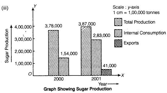
Question 14.
(i) Present the data in tabular form.
(ii) Suppose you were to present these data in diagrammatic form which of the diagrams would you use and why?
(iii) Present these data diagrammatically.
Answer:
(i) Data in tabular form.Sugar Production in India
| Total Production (tonnes) | Off-take for Internal Consumption (tonnes) | Off-take for Exports (tonnes) | |
| December 2000 | 378000 | 154000 | — |
| December 2001 | 387000 | 283000 | 41000 |
(ii) The data can effectively be presented diagrammatically using the multiple bar diagram. This is because multiple bar diagrams are used for comparing two or more sets of data for different years or classes, etc.
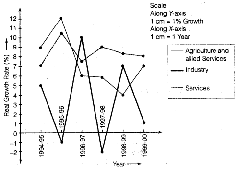
Question 15.
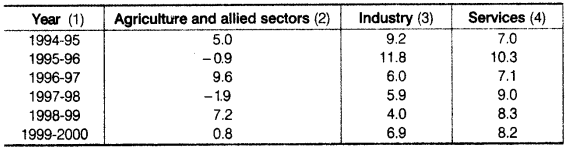
Represent the data as multiple time-series graphs.
Answer:
NCERT Class 11 Economics Statistics for Economics
Class 11 Economics Chapters | Economics Class 11 Chapter 4
Chapterwise Indian Economic Development Class 11 NCERT Solutions
-
NCERT Solutions For Class 11 Economics Chapter 1 Indian economy on the Eve of Independence
NCERT Solutions For Class 11 Economics Chapter 2 Indian Economy (1950 – 1990)
NCERT Solutions For Class 11 Economics Chapter 3 Liberalisation, Privatisation and Globalisation: An Appraisal
NCERT Solutions For Class 11 Economics Chapter 4 Poverty
NCERT Solutions For Class 11 Economics Chapter 5 Human Capital Formation In India
NCERT Solutions For Class 11 Economics Chapter 6 Rural Development
NCERT Solutions For Class 11 Economics Chapter 7 Employment Growth, Informalisation and Other Issues
NCERT Solutions For Class 11 Economics Chapter 8 Infrastructure
NCERT Solutions For Class 11 Economics Chapter 9 Environment and Sustainable Development
NCERT Solutions For Class 11 Economics Chapter 10 Comparative development Experiences Of India and Its Neighbors
Chapterwise Statistics for Economics Class 11 NCERT Solutions
-
NCERT Solutions For Class 11 Economics Chapter 1 Introduction
NCERT Solutions For Class 11 Economics Chapter 2 Collection of Data
NCERT Solutions For Class 11 Economics Chapter 3 Organisation of Data
NCERT Solutions For Class 11 Economics Chapter 4 Presentation of Data
NCERT Solutions For Class 11 Economics Chapter 5 Measures of Central Tendency
NCERT Solutions For Class 11 Economics Chapter 6 Measures of Dispersion
NCERT Solutions For Class 11 Economics Chapter 7 Correlation
NCERT Solutions For Class 11 Economics Chapter 8 Index Numbers
Post a Comment
इस पेज / वेबसाइट की त्रुटियों / गलतियों को यहाँ दर्ज कीजिये
(Errors/mistakes on this page/website enter here)